Your Website Will Work Better When You Realize It’s Not Your Website
Warning: Use of undefined constant blog - assumed 'blog' (this will throw an Error in a future version of PHP) in /home/www/vitruvianadvertising.com/wp-content/themes/vitruvian/functions.php on line 1049
This blog by Howie Jacobson was originally posted on Fast Company.
 As an American spending a year in South Africa, I’m horrified by South African drivers. Every single one of them drives on the wrong side of the road. No matter how much I honk, yell, and gesture, they just keep doing it. And the police are no help either. They don’t care, or (and this may just be my imagination) they actually encourage it.
I don’t totally blame them; the steering wheels are all on the wrong side of their cars. That’s probably the source of a lot of the confusion.
When I insist upon driving on the correct (right) side of the road, it causes so much chaos that I hardly even bother anymore. The other drivers honk, yell, and gesture back; I guess people are pretty sensitive about having their inadequacies pointed out to them.
I’ll tell you one thing, though. I may not be able to change them. But they’re sure as hell not going to change me.
Kidding! (Mostly)
I’m kidding, of course. But before you dismiss this ridiculous metaphor, realize that many website owners think this way. They stubbornly believe they know the correct way to navigate their own website, when the vast majority of their visitors are telling them otherwise.
It’s Not Your Website
Think about your website. Here’s the big mindset shift I want to your consider: It’s not your website. You think it’s yours because you registered the domain name, paid for hosting, wrote the copy and signed off on the design. But it isn’t yours. It belongs to your visitors.
If not for your visitors, that website would have no reason to exist. It’s there to solve their problems. To help them improve their lives. And they, not you, decide what to read, what to watch, and what to click.
Is Your Website UFO?
UFO is an acronym I coined that should be much more popular in usability circles. It stands for User Freaking Obvious. It’s based on Ethority CEO Mike Psenka’s observation that the familiar term “User Friendly” is a pretty low standard when you want people to interact with your stuff, be it website, software, or digital camera.
Nobody wants to read the manual. Nobody wants to struggle and ponder. Nobody even wants to break stride. If your website requires any of the above–that is, if it’s not User Freaking Obvious, your prospect will hit the “back” button and search for a site that is.
I’ve done consultations for clients whose sites were created to sell products. When I’d point out to them that I couldn’t figure out how to buy those products, I would hear a barely audible sigh of frustration at the other end of the phone.
“Just click the Online Catalog button on the left sidebar–that’s the third one down–and then click “Shop Now” from the drop-down menu. On the next page, scroll down to the bottom and click the “See All Products” link. You should be at the store now.”
Oh. That was, er, not entirely obvious.
How to tell if your site is UFO
As website owners, we have no idea if our sites are well-designed or not. I can spot a typo in someone else’s writing from 5000 feet, yet my own home page had a typo in the first sentence that I didn’t notice for almost two years.

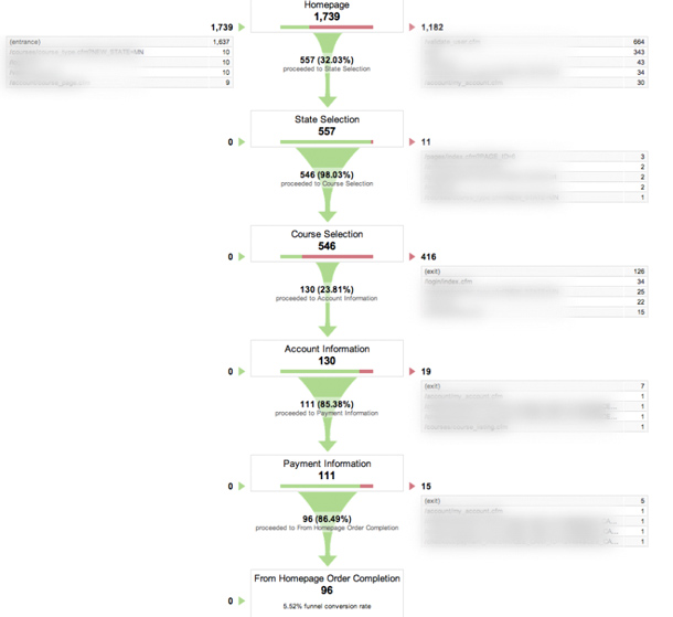
So take it from someone who knows–instead of trusting your own user experience on your site, you need to watch other people trying to navigate it to achieve their goals. A free tool for visitor watching is Google Analytics, which lets you set up visitor goals and then observe where your prospects are abandoning the goal funnel.
In the screenshot below, you can see how 1739 visitors to the homepage turn into 96 new orders. The downward path is how the website owner wants their prospects to drive. The right column shows all the detours and dead ends and escape routes that keep visitors from converting into customers.
The biggest obstacle to conversion appears to the be the “Course Selection” page, which welcomes 546 visitors yet sends only 130 to the next step, Account Information.

How to Fix a Website
First, use Analytics to identify the weakest link in your conversion funnel. That’s where the roads, signage, and traffic rules are confusing and discouraging your visitors the most. Travel that road with your prospect in mind:
- What would they naturally expect to find on this page?
- What questions or objections are still unanswered?
- Where would they expect the button or form to reside on the page?
- Is your conversion goal too ambitious for their present state of awareness, desire, and trust?
- Should you settle for a lower commitment, safer conversion at this point?
Once you’ve come up with a list of questions and possible answers, use Google’s free Website Optimizer software to test variations of that page. Given sufficient traffic, you can quickly see which variation best accommodates the way your visitors naturally drive.
Keep a Search Diary
Every so often I find myself making a purchase or signing up for a newsletter effortlessly and without hesitation. The site is so intuitive and so in tune with the way I naturally search, browse, and commit that I don’t even notice how good it is.
I’ve started keeping a search diary, triggered by such a purchase or signup. I stop myself at the end of the transaction and ask, “Why was that so compelling? What did it seem like the obvious thing to do? What made it seem easy (even if it wasn’t)?”
These notes help me learn from my own online shopping experiences so that I can apply the best practices to my own sites.
Gotta End With This Joke
A guy’s driving on the highway when he gets a call from his wife: “Honey, I just saw on the news that some crazy guy is driving the wrong way on the highway.”
“Some crazy guy?” he replies. “It’s freaking all of them!”
One thought on “Your Website Will Work Better When You Realize It’s Not Your Website”
Comments are closed.

I was speaking to a very nice man today in a hardware store today, and the subject came around to websites. Having read this piece and shared this attitude for as long as I can remember, I spoke to him of most people that write for their website as if it was the inside of their front door. After all this is the bit you always see and like and it fits your mood and character perfectly.
The problem is that only your friends see the inside of your front door, most passers by see the uncared for outside and walk by.